BeforeOriginal Accounting Center
01.
Original member accounting view
A compact page with an aging summary table, purchase-order information and accounting alerts presented in a text-heavy layout.
A visual rethink of Independent Suppliers Group’s digital experience—bringing its cooperative story, member resources, and supplier relationships into sharper focus.
Explore the transformation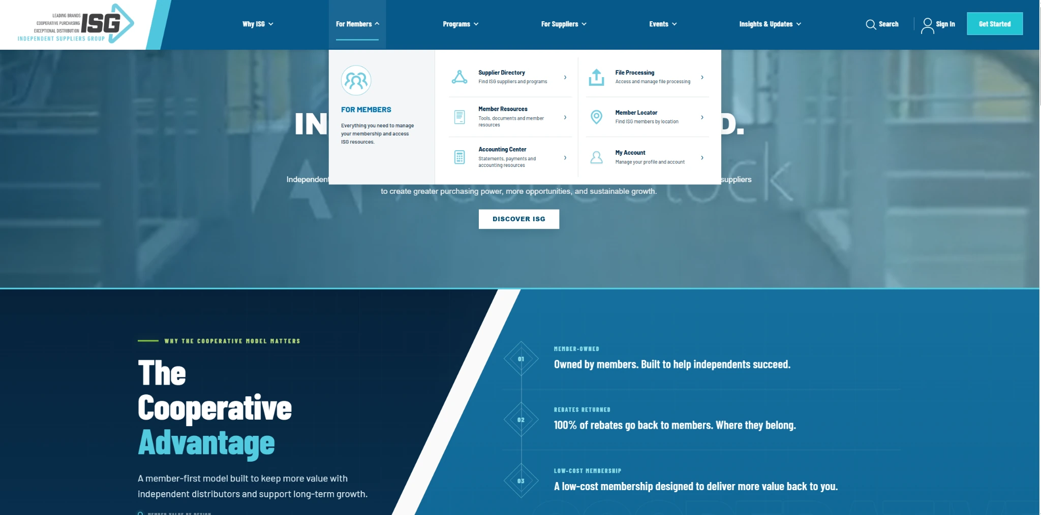
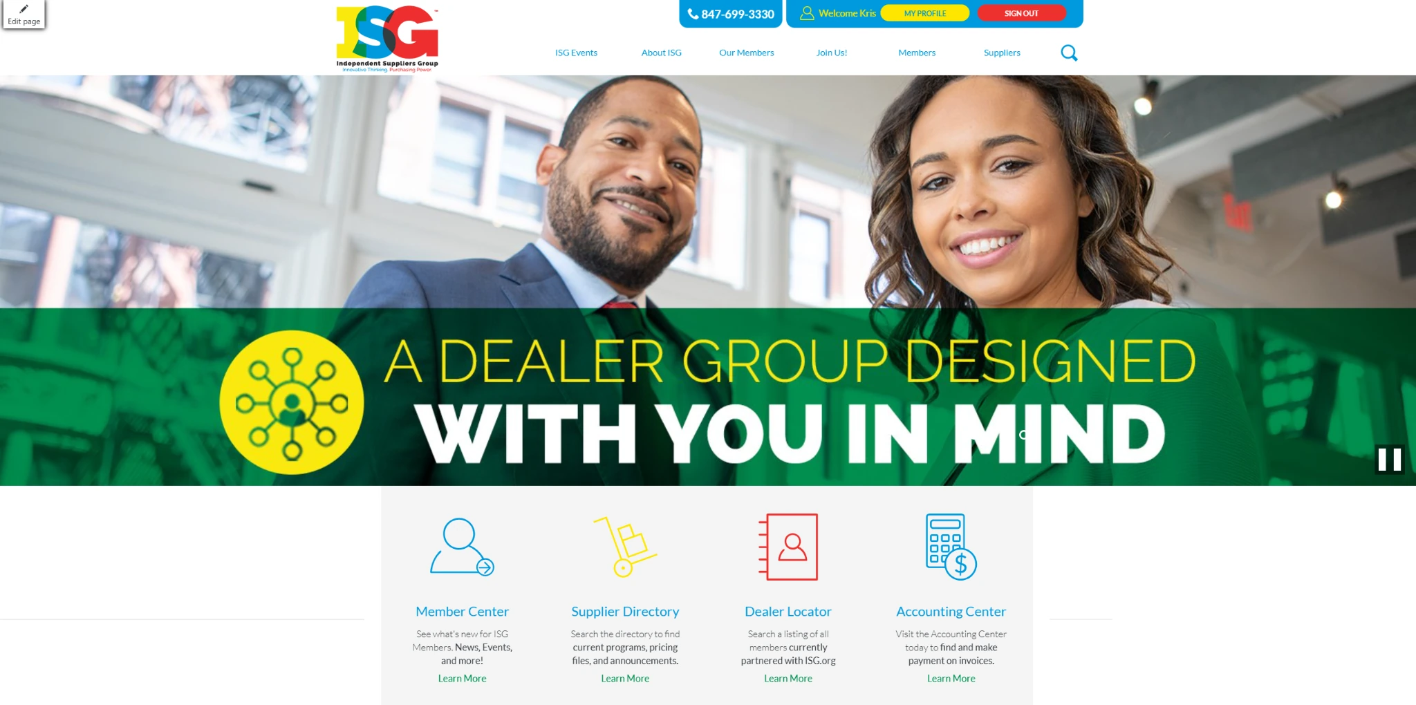
Move the divider to explore the original homepage beside its redesigned counterpart. Every image in this case study comes from the actual ISG project.
The redesign puts the cooperative’s value up front, organizes the site around the people it serves, and creates more breathing room for important content.
A refreshed visual identity brings a more deliberate hierarchy, modern typography, and a cohesive blue-led palette.
A structured navigation system makes the member, supplier, and program pathways more visible.
Dedicated sections put membership reach, supplier partners, services, and news into clearer context.
The former homepage brought together account shortcuts, spotlight features, company information, updates, events, and newsletter signup in a traditional page layout.
An editorial collage of the actual redesign, from the national member network and supplier brands to value-added programs and a more unified footer.
The redesign extends into ISG's member resources. Compare the original Accounting Center overview with the updated Accounting Center Help and invoice interface.
A compact page with an aging summary table, purchase-order information and accounting alerts presented in a text-heavy layout.
The updated interface introduces organized invoice search, clearly grouped actions, readable tables and expandable help, payment and banking sections.
The original About Us page was functional but text-heavy and visually limited. The redesign turns that same story into a richer brand page with a stronger introduction, clearer value messaging, a visual timeline, and a more human leadership section.
The older page relied on a very basic content column, minimal imagery, and long uninterrupted text blocks that made the story feel flat and less engaging.
A clearer headline, sharper imagery, and a more confident layout immediately communicate who ISG is and what makes the cooperative valuable.
Mission, value, history, and leadership are broken into purposeful sections so the page reads more like a guided brand story than a single wall of copy.
Timeline moments, stats, and leadership portraits help make the organization feel established, transparent, and member-focused.
The old Join ISG page centered on a basic form and dense explanatory copy. The redesign opens with a stronger introduction, gives visitors clearer paths for becoming a member or supplier, and makes the page feel like an intentional entry point into the network.
The previous version asked visitors to commit to a long form right away and offered little visual guidance or structure around the two audiences the page serves.
The redesign shifts from a single generic form to a guided experience with stronger hierarchy, two distinct pathways, benefit highlights, and a friendlier call to action.
The updated page is designed to convert by helping users understand where they fit in the ISG ecosystem before asking them to take action. It balances explanation, credibility, and next-step clarity—especially for members and suppliers who arrive with different goals.